Art Guidelines
Follow these guidelines to ensure that your kit is visually appealing.
Colors
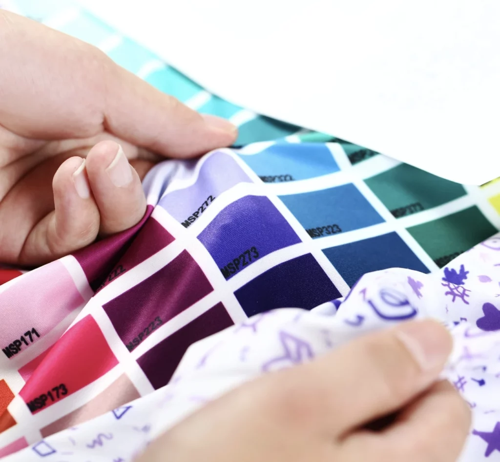
Colors print differently on cloth than they do on paper and screen.The color on fabric can vary due to differences in ambient temperature, machine, and ink. To ensure that the colors are consistent with your expectations, we use different machines and fabrics with the same parameters to convert Pantone Colrs into Ecyker fabric color swatches and we offer it for free.

Fonts
Make sure to convert all your text to outlines in Illustrator or include your font files. Otherwise your fonts may be automatically converted to something you don’t like or want.
LOGOS, GRAPHICS
All logos and artwork should be in vector format (Illustrator .ai or Freehand .eps). A vector graphic retains its clarity when it is scaled for different sizes.
TIPS TO CONSIDER WHEN DESIGNING YOUR GARMENTS
- Printable in black Lycra, which is commonly used in shorts and bibs, will appear as a'mucky' black when stretched on the body. This is a less than good look, therefore, it's a good idea to avoid printed black areas directly next to non-printed black areas, as they may not look like similar shades of black.
- White or light-colored rear panels on shorts/bibs will be more transparent than darker-colored panels.
- Gradients and fades used with red will turn pink as the color lightens.
- Very steep gradients between light and dark colors may appear to be separated by lines.
- Full black on shoulders of garments can be very hot in certain climates.
- Rear pocket graphic/test alignment: The top or bottom of the jersey pockets require meticulous alignment when constructed. Sometimes we need to slightly adjust the graphic so that it does not intersect at the pocket.